The price history chart only shows me a years worth of history
The price history charts within the details of an investment are fixed in terms of what they display. The idea is that these provide a
limited snapshot of the investment history in a defined period.
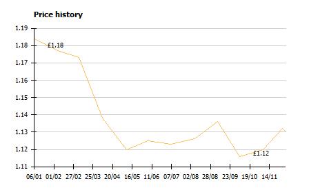
A typical investment chart in the investment details will show one years
worth of data, as shown below. This may not be enough for what you want to see.
The chart is, however, customizable if you save it as a favorite. This will allow you to see more history or see the
chart with a different view.
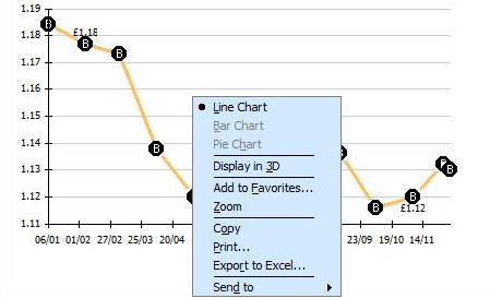
To say as a favorite, right click on the chart (you can see the add to favorites option
on the image below.
Next, go to your reports, and find the saved price history chart in your favorite reports. Because it is now in the reports
area, you can customize it to show the date range you want to see. Doing this allows you to be much more flexible in how you view
your data, as you can add on other investments, change the date range etc.
Keywords: quote prices, history